I've finished modeling up the Scout fighter - It uses subsurfacing and additional detail pieces separate from the hull model so that I can create lower-poly versions from it by generating maps straight from the geometry.
Saturday, September 17, 2011
Tuesday, August 23, 2011
Site Map
Thursday, August 11, 2011
Taiidan Scout Progess
I've done a bit more work on the Scout fighter project - I've got the hull shape mostly finalized and I'm doing some tests to see how the detail pieces work out and how I can optimize the model as a whole while still creating a smooth, high-detail mesh. My direction so far is starting at the nose (as it has the most intricate details) and working backwards to the tail end of the craft.
Tuesday, August 2, 2011
Scout Project
It's been a while since I worked on something fantastic - As a new project I'll be working on a high-detail version of the iconic Taiidan Scout from Relic's Homeworld series. It's a great design and some of the concept work has great detail that I would love to try and replicate in 3D.
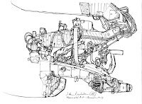
Here's the in-game model - Homeworld was released in 1999, and so full-3D in games was still somewhat new, but Relic's TA's did a great job and conveying everything even with such limited capacity.
I've got the basic shape down, and I'll probably start at the nose and work my way back adding in the details. Below it you can see the great concept drawing that inspired me in the first place.
Further Card Revisions
I'm re-working the card designs thanks to a lot of good feedback. One of the issues I've had is working the eye logo into the card and layouts, and I'm having a lot of problems fitting it in properly. As much as I like the logo, I tried some designs that completely ditched it and I think they work better.
I also looked at having the stripes vertical, but I'll sleep on it for a while - It doesn't feel as smooth to read as the one above.
Again, I'm trying to find a way to include the logo, and I feel that If I were to include it it would need to be separate from the text to stop the card from being too busy, hence using it on the reverse side.
I've tried the same idea for the flat layouts as the first card, and I think it improves it - It also takes away the dominating effect that having the logo generated.
Tuesday, July 26, 2011
Final Cards and Questionnaire
After the responses from Ms. Ryan, I've tweaked the cards and flat/page layouts.
Shauna Ryan is a Designer for the Creative Design Team here in Tampa - She does interior design work, but also does some Graphics designs as well. She's been in the field for almost 3 years.
You can find her LinkedIn Profile here:
http://www.linkedin.com/pub/shauna-ryan/12/612/71a
Shauna Ryan is a Designer for the Creative Design Team here in Tampa - She does interior design work, but also does some Graphics designs as well. She's been in the field for almost 3 years.
You can find her LinkedIn Profile here:
http://www.linkedin.com/pub/shauna-ryan/12/612/71a
Tuesday, July 19, 2011
Logos
I've looked at My logo and card setups, and thought of improving my existing one as well as seeing if I can create something new. I sketched out some ideas, and one I liked a lot was a shape of the eye with the pupil replaced by a cog shape.
I also looked at some card designs, both horizontal and vertical.
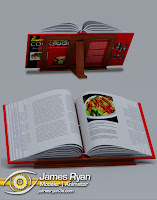
I also looked at a flatbook type layout, and found that instead of the solid bar i had previously, a small icon with transparency worked more to my taste.
I also looked at some card designs, both horizontal and vertical.
I also looked at a flatbook type layout, and found that instead of the solid bar i had previously, a small icon with transparency worked more to my taste.
Wednesday, June 15, 2011
Some More Renders
Here's some more renders of some of the work I've done for MediaLab. I can't express enough how great an opportunity that was, I really coulnd't have asked for a better place to gain some real experience.
Monday, May 30, 2011
Shiny
I made a teapot. There were some reasonably challenging parts of the model, but because it would feature a lot of shiny and reflective surfaces, I went to a higher level of detail and poly count than is usually necessary for this type of model. I'm satisfied with how it looks rendered in a fairly plain studio environment, though I still feel even at this point the black material of the pot will need more tweaking to get just right.
Monday, May 23, 2011
Some Sample Furniture Asset Renders
Here's some first-stage renders for some of the furniture pieces I've been working on - So far, even with low-res texture maps they're coming out very well I think. I'm surprised at how reasonably convincing they are, even at this low-res stage.
Saturday, May 21, 2011
Terrain Test
While working on some rocks for MediaLab, I decided to do some research into how other people have created rocky environments that are both quick to make and to render - I found one method that uses an asteroid generator script at http://vray.info/tutorials/vrayrocks/default.asp and did a quick test.
To make the scene only took about 10 minutes, and render time was just under an hour. There's still some geo tearing from the displacement but the method centers around using a combination of bump and displacement maps to generate the rocky surface. It's a technique I applied to the rocks I was working on, and even on a smaller scale like lawn decorations it produces a good, convincing result.
To make the scene only took about 10 minutes, and render time was just under an hour. There's still some geo tearing from the displacement but the method centers around using a combination of bump and displacement maps to generate the rocky surface. It's a technique I applied to the rocks I was working on, and even on a smaller scale like lawn decorations it produces a good, convincing result.
Monday, May 9, 2011
Final Flat layout
I followed some design cues from the site concepts to help tie them together, but it still follows the earlier design.
Tuesday, May 3, 2011
Site Layout design
Tuesday, April 19, 2011
Final Card and Layout Design
Tuesday, April 12, 2011
Cards and Flat-Layout Concepts
I've put together these concepts for a business card and a Flat-book layout to use with rendered images, both are simple but follow the same pattern.
With the card, I have the overall design as a concept I'm content with, but I'm also looking into vertical layouts, hence the two examples. The design and coloring carries over to the flat layout here:
I've decided to have the info-bar float rather than lay flush with the bottom of the page because it feels as though it takes up less space than a flushed sit, and also gives an impression of depth over the rendered image - I found it to be more appealing this way. I'm using a cropped version of the logo because in order to fit the entire thing in the bottom bar it would be too small, and it also breaks up the invisible bordering of the text, preventing over-repetition while still tying it into the card design.
Subscribe to:
Comments (Atom)


