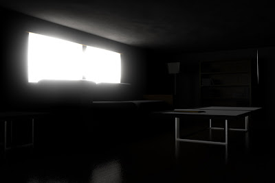
One thing that I've not had much practice with is lighting a scene in a way that is more than just functional, but actually adds greatly to the scene. I decided to keep with a very simple living area as a start, with very simple, low-poly models populating the scene. I wanted to give the impression that the viewer had just gotten home or woken up, and so no lights are turned on inside. This worked in my favor, as adding extra lights inside the room took away from the image.
Link to full sized render, 1440x960:
http://img543.imageshack.us/img543/627/livingarea.jpg
As stated above, the main purpose of the project was to demonstrate lighting more than modeling, and so I used very simple models of the room and furniture:
The next step was to add some simple textures, mostly from the Arch&Design templates within 3DS Max. These added a bit more realism to the scene, and although originally I had intended to have only grayscale shades to show pure lighting, I found that the image was much clearer and more appealing with the wood texture adding some color to an otherwise bland, gray scene. The wood floor turned out especially well in the final render.
Here you can see the light source - it doesn't quite light up the scene yet, but it is starting to provide some indirect illmunation and shadows.
The next step was to simulate how bright the light coming from outside was, so I used a camera glow modifier and a pair of mrSky Portals to simulate the effect.
Next, I used volume lighting to have the light source really fill the room. Here you can see the scene rendered with only a neutral gray texture:
Overall, the project turned out well. Many of the techniques I learned going through this project I will use on almost everything from here on out.


No comments:
Post a Comment